The canvas element (new to HTML5) is used to draw 2D and 3D graphics into an HTML document. Using Javascript you can draw a wide range of objects into an HTML canvas such as lines, text, images and shapes using several built in function.
One of the uses of the canvas is element is the visualization of data. By making use of the graphics functions provided in Javascript, you can create graphing functions that visualize a given set of data.
In this tutorial you will learn how to create a pie chart function that takes a dynamically sized array that contains each piece of data, and transforms that data into graph form
Drawing a basic pie chart using Javascript
To draw each segment of the pie chart, you can make use of Javascript's arc() method which draws an arc from one specified angle to another (in radians) starting from a given origin point.
Firstly, you will need to add a new canvas element into your HTML
document, here we will make one with a width of 400, and a height of 250.
<canvas></canvas id="test_canvas" width="400" height="250">
The pie chart itself will take up only 200 pixels of the width and height, the extra width will be used to add labels and the extra height will be used to add a title later on.
To calculate the size of each element on the pie chart, you will need to find the total value of each piece of data combined and calculate the percentage of that total for each piece of data.
As the angle for the arc() method must be given in radians (0*PI - 2*PI), our starting point for the first segment will be at position 0 * PI (the right side of the circle) and end at position 2 * PI. The ending point of each segment will be calculated based off its percentage value of the total, once a segment has been drawn, the starting point of the next segment will be the ending point of the previous one.
As each segment will need to stand out, we'll give them each a unique color which will be stored in an array, this array will correspond to the array containing the data.
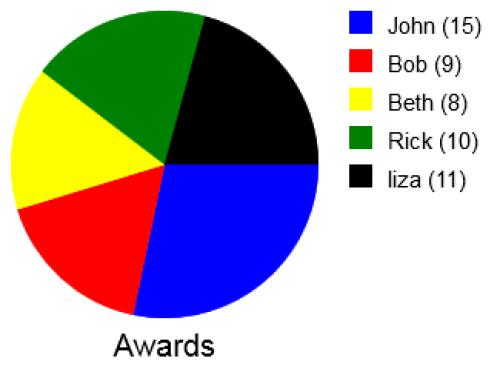
As an example, let's create a pie chart that visually displays the number of awards a group of people have received in their lifetime. Each element in our data array contains the name of the person and the number of awards they have received:
var data = [ [ "John", 15 ], [ "Bob", 9 ], [ "Beth", 8 ], [ "Rick", 10 ], [ "liza", 11 ] ];
var colors = [ "blue", "red", "yellow", "green", "black" ];

var canvas = document.getElementById( "test_canvas" );
var context = canvas.getContext( "2d" );

// get length of data array
var dataLength = data.length;
// declare variable to store the total of all values
var total = 0;

// calculate total
for( var i = 0; i < dataLength; i++ ){
    // add data value to total
    total += data[ i ][ 1 ];
}

// declare X and Y coordinates of the mid-point and radius
var x = 100;
var y = 100;
var radius = 100;

// declare starting point (right of circle)
var startingPoint = 0;

for( var i = 0; i < dataLength; i++ ){
    // calculate percent of total for current value
    var percent = data[ i ][ 1 ] * 100 / total;

    // calculate end point using the percentage (2 is the final point for the chart)
    var endPoint = startingPoint + ( 2 / 100 * percent );

    // draw chart segment for current element
    context.beginPath();
    // select corresponding color
    context.fillStyle = colors[ i ];
    context.moveTo( x, y );
    context.arc( x, y, radius, startingPoint * Math.PI, endPoint * Math.PI );
    context.fill();

    // starting point for next element
    startingPoint = endPoint;
}
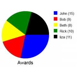
The pie chart created will look like this:
At this point it is difficult for the end-user to tell which segment represents which person, but we will fix that in the next section
Adding a heading and labels to your pie chart for reference
As the current chart does not show which segment belongs to which piece of data or the actual value of that data, we will add labels to the side of the chart that display this information. We'll also add a heading underneath the pie chart to add some context.
Each label will contain a color reference to a segment in the form of a colored square which will be drawn using the rect() method, and the name of the data element to which it refers as well as the actual value of that data.
The heading will be placed underneath the pie chart, we'll center this using the
textAlign property of the context object
.
To add the labels, this code will be added just after drawing a segment within the loop:
// draw labels for each element
context.rect( 220, 25 * i, 15, 15 );
context.fill();
context.fillStyle = "black";
context.fillText( data[ i ][ 0 ] + " (" + data[ i ][ 1 ] + ")", 245, 25 * i + 15 );
To add a heading, this code will be added just after the loop:
// draw title
context.font = "20px Arial";
context.textAlign = "center";
context.fillText( "Awards", 100, 225 );
Now the full code for creating a pie chart will be:
var data = [ [ "John", 15 ], [ "Bob", 9 ], [ "Beth", 8 ], [ "Rick", 10 ], [ "liza", 11 ] ];
var colors = [ "blue", "red", "yellow", "green", "black" ];

var canvas = document.getElementById( "test_canvas" );
var context = canvas.getContext( "2d" );

// get length of data array
var dataLength = data.length;
// declare variable to store the total of all values
var total = 0;

// calculate total
for( var i = 0; i < dataLength; i++ ){
    // add data value to total
    total += data[ i ][ 1 ];
}

// declare X and Y coordinates of the mid-point and radius
var x = 100;
var y = 100;
var radius = 100;

// declare starting point (right of circle)
var startingPoint = 0;

for( var i = 0; i < dataLength; i++ ){
    // calculate percent of total for current value
    var percent = data[ i ][ 1 ] * 100 / total;

    // calculate end point using the percentage (2 is the final point for the chart)
    var endPoint = startingPoint + ( 2 / 100 * percent );

    // draw chart segment for current element
    context.beginPath();
    // select corresponding color
    context.fillStyle = colors[ i ];
    context.moveTo( x, y );
    context.arc( x, y, radius, startingPoint * Math.PI, endPoint * Math.PI );
    context.fill();

    // starting point for next element
    startingPoint = endPoint;

    // draw labels for each element
    context.rect( 220, 25 * i, 15, 15 );
    context.fill();
    context.fillStyle = "black";
    context.fillText( data[ i ][ 0 ] + " (" + data[ i ][ 1 ] + ")", 245, 25 * i + 15 );
}

// draw title
context.font = "20px Arial";
context.textAlign = "center";
context.fillText( "Awards", 100, 225 );
The new pie chart drawn will look like this:
Creating a function to dynamically draw pie charts in Javascript (example)
To make it easier to draw pie charts for different data sets, we can create a function using the above code that will take a title, an array containing the data, and an array containing the colors to use as arguments.
function drawPieChart( data, colors, title ){
var canvas = document.getElementById( "test_canvas" );
var context = canvas.getContext( "2d" );
// get length of data array
var dataLength = data.length;
// declare variable to store the total of all values
var total = 0;
// calculate total
for( var i = 0; i < dataLength; i++ ){
// add data value to total
total += data[ i ][ 1 ];
}
// declare X and Y coordinates of the mid-point and radius
var x = 100;
var y = 100;
var radius = 100;
// declare starting point (right of circle)
var startingPoint = 0;
for( var i = 0; i < dataLength; i++ ){
// calculate percent of total for current value
var percent = data[ i ][ 1 ] * 100 / total;
// calculate end point using the percentage (2 is the final point for the chart)
var endPoint = startingPoint + ( 2 / 100 * percent );
// draw chart segment for current element
context.beginPath();
// select corresponding color
context.fillStyle = colors[ i ];
context.moveTo( x, y );
context.arc( x, y, radius, startingPoint * Math.PI, endPoint * Math.PI );
context.fill();
// starting point for next element
startingPoint = endPoint;
// draw labels for each element
context.rect( 220, 25 * i, 15, 15 );
context.fill();
context.fillStyle = "black";
context.fillText( data[ i ][ 0 ] + " (" + data[ i ][ 1 ] + ")", 245, 25 * i + 15 );
}
// draw title
context.font = "20px Arial";
context.textAlign = "center";
context.fillText( title, 100, 225 );
}
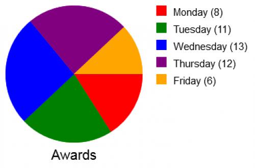
var data = [ [ "Monday", 6 ], [ "Tuesday", 11 ], [ "Wednesday", 13 ], [ "Thursday", 12 ], [ "Friday", 6 ] ];
var colors = [ "red", "green", "blue", "purple", "orange" ];
// using the function
drawPieChart( data, colors, "Sales" );
This will draw the following pie chart to the canvas:
Using a function gives the code much more modularity, making it quicker and easier for you to use for other purposes.
Other data visualization tutorials:
-
Creating line graphs with Javascript using an HTML canvas
.